Tuesday, 22 April 2014

Screen Printing Mirrors

My final major project is going to be made up of 3 canvasses 2 portraits and a central piece that will be a gilded mirror carrying a message, much like the magic mirror from the Snow White fairy tale, it will be this central piece that will tie the flanking portraits together.
Drawing a mirror, how hard could that possibly be? Turns out it was much harder than I had imagined.
I had an image of how I wanted the mirror to look,
I wanted a Georgian style ornate frame, and detailed, very detailed.
Once I had found an example i could work from I had to break it down into layers that would form a finished screen print to then lay over my painted canvas.


The Image above is of two of the three layers I drew on acetate to use to play with some colour schemes for the finished screen print.

So I took it to the print room not only to practise with the images and colour tests but to make sure the image worked as a screen print before I enlarged it to the full A1 size of the final piece.


During the tests, one thing became apparent, that using black ink was not an option, It gave the illusion of an outline, I wanted the image to flow but look natural, and thats not something you can do using outlines.
I learned other valuable lessons too, for instance making sure my printing medium was the correct viscosity, if it is too thin then it will bleed and detract from the detail of the drawing.
The first colour scheme was my preferred choice, but for the final piece I will be substituting the main Yellow layer for the golden medium ink That I used on the black background.


Mark meet Marx

While I was generating ideas around Alan Turing and Snow White connection, I was challenged by my course leader to make a similar connection between another two seemingly unrelated persons/characters.
During the discussion Karl Marx came up, I learned that although born in Germany he actually wrote his theories of Marxism, here in Manchester.
Now though I had heard of Karl Marx and Marxism, I was far from fluent in understanding what Marxism is and what the theories of Marxism contain.
So began a Marxism crash course, attempting to understand who the man was and what he stood for, after all I couldn't find a link to anybody else if I didn't know what I was attempting to find a link to in the first place.
After almost a week of reading, I finally felt that I had a firm grasp of Marxism and what Karl Marx was about.
I sat down to start breaking it down into key words I could then illustrate and begin using to discover another link but before I even got that far I was reminded of Robin Hood, as Marxism, in my understanding is all about fairness and equality within social groups.
The link had seemingly found itself,
so I had my subject matter and set off drawing it and experimenting with ideas.
It became apparent fairly quickly that drawing Karl Marx and capturing a recognisable likeness was actually fairly easy due to his predominant white beard and black moustache, so I moved onto trying to combine Robin Hood with Karl Marx, again this was quite a lot of fun!.

I tried many different combinations and styles, cartoons, traditional portrait and minimalist strokes,
After much debate I felt like the bottom image was the one that achieved the effect that I wanted in the best way.
It will be this image I turn into a screen print for the Karl Marx portrait as a final piece for my major project, to hang beside the Alan Turing, Snow White hybrid Portrait.


7 Criminals

While researching Alan Turing for  my project I became wound up at the fact he was persecuted for something that was natural.
I wanted to emphasise the ignorance in the prejudice and this left room for me to show just how silly it actually was.
I had drawn out some ideas using the seven dwarfs, to keep in line with the snow white theme but depicted them as different criminal elements, it was fun and gave a light hearted option to what had been up to date a fairly sombre ideas development process.


As much fun as it was to spend time playing with bright colours and fairly simple subject matter, I felt that this was a step too far away from what I had initially set out to achieve and so resigned it to proverbial scrap heap.
That was until a tutorial with my tutor group in which the drawing cropped up again and I was urged to continue along this line.
Bigger and individual was the plan of action for this section of the project.
I cant say that I was disappointed because it was just so much fun to do and play with. 
So after many drafts and drawing up other ideas I had created and painted 7 individual images of Walt Disney's dwarves depicting common stereotypes of different types of criminal, perpetrators of real crimes, crimes much worse than homosexuality.


I knew while painting them that they were going to a little close to the bone and could be construed as offensive but was told that I shouldn't really worry about that, since art and controversy often go hand in hand.
It was a lot of fun creating these images and a far cry from the meticulous nature of painting organic shapes to create of a portrait as I have done so many times before.
This is most certainly an avenue I will explore again in the near future.


Portfolio Review 5: Chris Howker

Chris Howker was assigned as a mentor figure for the final year of the course.
Chris gave me my first real constructive critical review. At a time when I was used to being told what I wanted to hear, at first I took his critique personal until I sat and thought about it and realised he was right.
Asking him to be my final portfolio made sense really, to see if I had taken onboard the points he made and more importantly whether I had managed to apply them to my work.
Here is what Chris had to say this time around

Hi Mark,

Thanks for getting in touch again, glad to hear the course is going well and all is good.

I'm sorry I couldn't meet up to have a look at your portfolio but I have managed to take a look at your website and the work you're exhibiting there. I hope I don't repeat myself too much in regards to previous conversations but at least let me recap for my own piece of mind.

The first and most striking part about your work is the style/method in which it's created and the subject matter. From a commercial point of view, the use of celebrities from music, film and sport is an excellent choice as you can almost guarantee that you will find an audience who is already a fan of your subject matter and more likely to buy/commission a piece of work if it is something that appeals to them. On the flip side, the images are produced from stills or photographs made by other creatives and as a result are often over saturated through the likes of t.v, print (magazines, newspapers, billboards) and the internet. This means that despite being all your own creative work (no computer technology/filter is involved) that the original image has been seen so many times before that it sometimes loses impact.
I am not a football fan so all the portraits of Manchester United players (both old and new) are very niche - only football fans will like the work and that limits your audience - I'm not saying start creating portraits of every team in the UK but have you considered making something that is a little more universal? 

Your portraiture work is so instantly recognisable which is a good thing when you are painting familiar likenesses, but the down side is that if you want to make this a source of income then you are competing against shops that digitally print the artwork onto canvas already and have a quicker turnaround. What can you do to make these unique and something that someone will say "I want a painting done by you because  ........" and will draw new people to come and look?

The wall mural you initially created for the "fish bowl" consists of various musicians spanning a few different genres - from Bob Marley to RUN DMC and from Marvin Gaye to Jay Z - which dont necessarily all go together but you have collaged the portraits together to create something more interesting on a whole, the overall shape draws the eye in, the simple black and white doesnt distract from key features of each portrait, the scale of each portrait is different which almost leads the viewer across the image but could also suggest that each of the artists featured actually makes up your own personal music choices with small influences from specific areas. If you took this method of collage and applied it to the other portraits (maybe creating the entire starting 11 for Manchester United in this style) then it would progress the work from a recreation of a photo or fan made piece into an individual and unique illustration. 

There is nothing wrong with using photographs and found imagery but it's how you use the images that can make the difference between illustration and artwork. Illustrations often have a narrative that inform the viewer of the message either directly or sometimes in an abstract fashion. Going back to the musician mural, that would suggest to me that it is a journey through music and progression of black musicians throughout the decades but the single image of Ian Brown doesnt suggest a narrative. If music is a large part of your interests then creating a collage of Manchester musicians could be something to look at. Whilst looking through the rest of your artwork - so I dont get too caught up on one piece - I remembered how I spoke about Banksy in our past conversations, he again uses photographs/found images but juxtaposes unlikely ones together to form a satirical but almost protesting opinion on a chosen subject. You could take portraits of celebrities but instead make them funny, exaggerate details in their faces (if they have a big nose, big ears etc) and make the images almost like caricatures. This could then turn a regular celeb portrait into something more unique and interesting. However, saying that, you may not want to do any of this and stick to your initial method in which case I would suggest just trying to use some of your own photographs (not of celebrities, unless you have famous mates) but of people showing the emotion on their faces as you seem to focus and tightly crop around the head. 

I also remember asking you how you made these images, if it involved the computer at all or if you were to stencil them with spray paint. I'm glad your answer to both was no, but I still think you could do some interesting experiments with screen printing in the way that you build up layers to form the shadows and highlights of the face. I really like your watercolour and ink pieces, these show your true talent in my opinion (and the so do the newest images you've sent through to me - snow white and the mirror/picture frame). You have an understanding of proportion and I think your composition on each of these portraits draws the viewer into the centre of the image - the subjects eye's! The watercolour piece "the Model" is my favourite because of the placing of the hand at the bottom of the image which balances the piece on the page.. I also like that they are just black and white, there is nothing to distract from the image and more attention is paid to shadows that create the form of a human face and even the negative space in between (e.g. the dreadlocks on "the landlord". we dont need to see each individual dreadlock but we can read from your image that he does have dreadlocks and isnt bald for example).

the one piece that throws me and stands out is the Biggie Smalls portrait. The expressive use of basic flat colours reminds me of Jean-Michel Basquiat's artwork on an aesthetic level and your other portraits also remind me of Andy Warhol's famous works but what I don't see from your website is the scale at which these works are created. Warhol for example created some portraits at a huge scale (http://www.theatlantic.com/china/archive/2013/12/how-andy-warhol-explains-chinas-attitudes-toward-chairman-mao/282665/) and he didnt accurately colour the images nor did he use realistic colours, this too could be something you could look at in the future.

If you dont mind me asking, what is the idea behind the 7 dwarves and the new roles/characters you've given each of them? I too have taken well known characters and tried to create the idea of "where are they now?" and the narrative of what has happened to them since their celebrity lime light has passed. the only downside I had to this was I wasn't creating anything original. I was taking an already existing character design and just altering it slightly for my own amusement, but if given the correct context this can work amazingly well. Ron English has taken an old favourite of mine (Tony the Tiger) and altered it to make you think more about yours and your childrens diets (https://www.google.co.uk/search?q=ron+english+tony+the+tiger&safe=off&es_sm=119&tbm=isch&imgil=qZTac1eyceNUtM%253A%253Bhttps%253A%252F%252Fencrypted-tbn2.gstatic.com%252Fimages%253Fq%253Dtbn%253AANd9GcRBmeQKlZMPHc_IEGJpgnyvWBFD6rCAn0X7LG6d_4-aq4RqioMU%253B600%253B410%253BFffVI7cVqKneaM%253Bhttp%25253A%25252F%25252Flaughingsquid.com%25252Ffat-tony-vinyl-figure-by-ron-english-satirizes-kelloggs-tony-the-tiger%25252F&source=iu&usg=__Hd0wtBuy3_zUvfqU_gAzHmYC5KU%3D&sa=X&ei=0SJUU9qlCNKv7AaCxYH4Bg&ved=0CDEQ9QEwAA&biw=1347&bih=659#facrc=_&imgrc=qZTac1eyceNUtM%253A%3BFffVI7cVqKneaM%3Bhttp%253A%252F%252Flaughingsquid.com%252Fwp-content%252Fuploads%252Ffat_tony_toy.jpg%3Bhttp%253A%252F%252Flaughingsquid.com%252Ffat-tony-vinyl-figure-by-ron-english-satirizes-kelloggs-tony-the-tiger%252F%3B600%3B410). 

BUT EVEN STILL.. this is not an original idea...Topps used to create Wacky packages which later led to the creation of the Garbage Pail kids - http://www.retroland.com/wacky-packages/. both designed to poke fun at existing brands and products.

The snow white image, I can't quite make out whose face you have replaced her's with, but I was actually drawn to the method you have used to create this piece. Because it is pencil, I am immediately more interested in it as I know it's hand drawn and later the addition of the red shaded layer looks like this is going to form an interesting work method. I actually like the tracing paper layer over the top of the original drawing as it flattens the large black areas and makes the red jump out more. The mirror/picture frame is amazing! theres so much going on in there and its all subtly created by the white space you've left, yellows and orange for the shadows. What is going to happen with this? 


Overall it's great to see that you've started developing your work as well as keeping what you already know and can do. I would love to see more development and experimenting in specific areas but that's easy for me to say, I always get excited trying to suggest ways in which to be creative but you may have a strong solid idea of where you want to take your work already.

I hope some of this has been useful at least.

take it easy and hope you had a good weekend fella.

Chris H

Monday, 21 April 2014

Portfolio Review 4: Jon Daniel

Jon Daniel is an Independent creative director from London.
I fIrst encountered Johns work in the first year of my degree course when writing a blog post about works I wish that I had done, the example I chose was this poignant, simple but very effective image to commemorate the twentieth anniversary of the murder of Stephen Lawrence in London.


So my reasoning in asking Jon to review my work was the depth and level of meaning within his work,  this was something I myself needed and so advice and direction from somebody with the elements in their work that I crave for my own was going to be ideal and pretty priceless.
Here is what Jon had to say..

Hi Mark Have had a look at your site and I think your "watercolour" works are by far the best work on the site. I think the others featuring music and sports icons are too similar to what is already out there, and if you are to do it then maybe think how you can make if more original and in a style of your own. I also was insure with those images whether they were actually painted or just digitally manipulated photographs. If the former then you need to do something to show that either photographing the artworks so I can see textures of the canvas or scale of the image may also help. I think you could look at the watercolours too and keep pushing it again to develop your style. Or even experimenting with the media you use to paint on? Eg. Old recycled packaging or cardboard boxes could add an interesting dimension to the work. Imagine a series of sportspeople but illustrated on old sports shoe boxes? Anyways that's all I got for you right now, but I hope you find it constructive and helpful. Warmest regards Johnny

So again a very short and to the point review, but also very helpful even offering ideas for future works, with plenty to mull over and take on board.
Jon also touched the same points that Kelzo and Chris Howker made in previous reviews.
This has struck home to the full extent now, that my work though aesthetically pleasing just does not stand out and its up to me to change that.
I will provide a link to Jon's website for you all to browse and appreciate in your own time.

www.jon-daniel.com


Portfolio Review 3: Kelzo

Tony 'Kelzo', is a renown graffiti artist from Manchester, he has been decorating parts of the city since the early 80's.
He is still an active artist who works to commission painting everything from walls to vehicles
I first came across his work when I was studying fine art at a city centre campus in 1999, It was a large abstract style piece, multi layered with angles coming and going in all directions, the colour gradients amazed me. I was an instant fan.
So while writing my dissertation when the opportunity came up to converse with the man himself and take his opinions on many subjects I was delighted.
When I was informed by the tutors that I was required to have my portfolio reviewed again, one of my first thoughts was that I'd like Kelzo to be one of the reviewers.
There were many reasons for my wanting him to look at my work and provide feedback, from the fact he is a local and relevant artist, and from past experiences, he is honest and accessible.
Being a busy man, he was hard to pin down so I sent Kelzo a link to my website so as he could go through my portfolio in his own time.
When Kelzo got back to me, he praised my work, but said there is alot of the same kind of thing out there already, so just as Chris Howker had told me a few months previous, he suggested doing some work that carries a little more meaning, work that says something.
He suggested that I experiment with application methods and the surface I am painting on, not just canvas and paper.
Kelzo also offered some tips and suggestions on the lay out of my website and photographing my work as well.
All in all, it was a short and to the point review, but I appreciated it that way as I knew that Kelzo had taken time out of a busy schedule to assist me.
Short though it was the advice he left me with was priceless as the experience he has in the industry dates back to before I was even born.
I have provided some examples of Kelzo's work, and a link to his website. www.kelzo.com


My Website

Finally, I have got a website, to exhibit my artwork, and a place to receive feedback from the public,
I wanted to keep it simple and user friendly rather than difficult to navigate for the sake of complicated over bearing aesthetics.
I am still constructing the site, attempting to improve it all the time.
so without further ado, here its. MarkStensonPortraits.co.uk
Please feel free to look around the site and also to leave feedback and comments.

Saturday, 19 April 2014

Hopes, Fears and opportunities

Again, we as a group have been asked to share our hopes, fears and opportunities.
Mine, personally have not changed since my first post on this subject in september.
I still hope to pass the course with my desired grade, my only real fear is that I wont achieve that outcome.
If pushed to add more, I would say now that the end is in sight, there is a deep down fear that maybe after all the work and effort, that I am not cut out to be a teacher.
I have sat down by myself numerous times and asked myself the same thing.
From a lad who at his own admission, is at home doing manual labour, a job that holds very little responsibility, its a worrying thought, that after 3 years at almost 30 years old, what if at the end of it, I am not cut out for the role I set out on this journey to take.
These are fears I can quickly put to bed with confidence, I am surrounded by a great circle of family, who themselves provide the inspiration I need to succeed, but their belief in me provides me with enough of anything I would need to dispel any thoughts of failure of inadequacy.
If I couple that with the direction and relationship I have built up with my current tutors, I know I have all the ingredients needed to actually move on and achieve the goals that were the catalyst for even 'going back to school'.
That being said, my hopes have not changed much either, they still go hand in hand with my fears.
I hope I don't fail, the same way fear failure.
I hope I can go on and achieve my dreams, I hope I don't end up failing my long term goals,
but the bottom line with these hopes and fears is this... Me.
It is down to me to make sure I don't fail, the power is in my hands, my tutors have made that perfectly clear... I can do whatever I want if I put in the work.
My Dad taught me the same thing from being young, you will get everything you deserve as long as you put in the work.
As for opportunities, these things are something that I have learned quite a lot about in the last 6 months.
At one point just before Christmas, with three young kids to provide for, my time got stretched that thin, coupled with juggling uni work, and earning enough money to stay afloat I was closer to dropping out than I have ever been.
To the point I had typed out the email and left it in my drafts box.
Before I made the decision to hit send, I was asked to do a commission, nothing special, just a usual run of the mill footballer portrait.
I did the painting... £65, not to be sniffed at, but was hardly a light at the end of the tunnel, yet the person I painted for later got back to me stating his friend had seen my work and wanted some doing.
Once I had finished talking to this mutual friend, I had negotiated a deal worth almost £700.
All because I had met an opportunity, regardless of size, head on.
It helped myself and family towards a comfortable christmas which in turn led me to believe that this is what I should be doing.
It is never going to be all plain sailing, but if something is worth chasing, chase it.
That instance was inspiration enough to help me fight through all the negative times, where my head sunk low and I was doubting myself, (which I know now is also natural) because hard work pays off.
Now, unless I'm hit by a bus, with my family and tutor group behind me, I am going to trudge forwards and achieve the goals I set out to, three years ago,
Heading towards my graduation, a pretty satisfied and fully determined young art teacher.

Treading Fine Lines

My primary aim for my final project is to celebrate unsung heroes related to Manchester,
I wanted to Celebrate them without offending anybody, so took a risk when I was experimenting with the idea of depicting Alan Turing as Snow White.
I wanted the image to put forwards the connections the two parties shared, for example, the 'problems' both had were natural.
Nothing could be done about Snow Whites beauty, it was natural, it was her Queens jealousy that was the real problem, as was the case with Turing's sexuality, and society of the time being so intolerable of homosexuality.
They both helped others, Turing with his input and knowledge bringing about the end of a world war and no doubt saving many lives with his efforts, and Snow White with her caring, motherly manner that she showed when taking care of the dwarves.
I had to be careful not to just draw a man dressed as Snow White and had to find as much of a natural bind as possible.
after many quick rough drafts, I felt that I had achieved this when I finished this drawing..


I was happy that I had managed to bind the innocence of both Snow White and Alan Turing, without crossing a line into cartoon or parody, as both of those sectors were pitfalls I wanted to avoid for now, I did however want to explore them later in the project as a nod toward the fun loving person that Alan Turing had been depicted as in my reading of him and also a nod to Walt Disney and the things he had done for animation. (Snow White and the Seven Dwarves being the first feature length animated movie).
I duplicated the image above numerous times, playing with colour, and how much to use and where to use it, finally settling on this variation.. It felt dramatic but still soft enough that neither Alan Turing or Snow White dominated the image.


Happy with the way things were progressing, I decided it was time to widen my view and try to find other avenues to help my project succeed in celebrating Alan Turing.

Drawing Alan Turing

There are many images of Alan Turing in books and online, often looking very sombre and every inch the mathematician and logician and scientist that he was.
I wanted to portray a different Alan Turing, one far from the posters found in I.T departments of high schools and colleges throughout the country.
I wanted to portray him, as the happy go lucky, friendly and outgoing person I discovered him to be during my research.
I began drawing a likeness and experimenting with different media, from coloured pens to screen printing, coming away with many variations and results, again another good feather in the proverbial cap when it comes to generating ideas especially when it is for such an important project.

Above are two examples of some of the first attempts of capturing Alan Turing in a more natural guise, 
In an attempt to portray him as an every day man, and not just the scientist that he was.
While exploring the idea surrounding the apple aspect of Alan Turing (the one with which he administered the fatal dose of Cyanide to himself).
I toyed with the idea of creating a portrait of Alan Turing, depicted within an apple itself.
Although tricky to do, I had some success, by scratching the flesh of the apple, and allowing air to dry it out naturally which in turn accented the marks that I had made, after a few attempts, varying the level of pressure applied to make the marks, 


This was an idea that I was keen to move on with, as the results were actually better than I had anticipated but after further attempts it was clear that the results were unpredictable and sporadic to rely on going into the later stages of the brief, so I was happy to leave it as a good idea and have it in my development file.


Final Major Project

Heading into the final major project of my degree course was a daunting task,
But after reading the brief and learning it was pretty much 'show us what you can do' I relaxed a little.
Being given a fairly free run at my own brief, I decided eventually that I would like to do something a based on Manchester, its people and history.
As I am a proud Mancunian I wanted to not just show off Manchester but to celebrate some aspects of it, and its people.
I spent much time trawling the Internet and libraries for information on the history of Manchester and famous people who have hailed from the city.
As expected the usual suspects cropped up a lot, new era celebrities, and sportsmen.
The Gallagher Brothers of Oasis fame, Ryan Giggs and Ricky Hatton amongst many many others.
I had already painted many of the people I was coming across connected with Manchester and since I wanted to highlight the importance of Manchester throughout history I kept digging further into Manchester's past.
A few names started to stand out and intrigue me.
Namely, that of Alan Turing, although he was not born in Manchester, he lived and died here and is celebrated on numerous sites throughout the city.
a Bridge and statue in his honour as well as a main thorough fare on the outskirts of the city centre named Alan Turing way.
His story is one of great achievement, tragedy and injustice.
The fore father of modern computing, who developed and built a machine capable of deciphering the Nazi German enigma codes used by their U-boats to communicate in secret.
The code breaking equipment proved pivotal in bringing about the end of the second world war but even after such a level of service to his Country, Alan Turing was charged with Homosexuality and chemically castrated with injections of the female hormone oestrogen.
The intrigue of the man and his story, as well as his almost anonimity amongst a generation who rely on gadgets he laid the foundations to create for ease of day to day living helped me decide that Alan Turing would be a key component of my final major project.
I set out to find out as much as I could about Alan Turing and his life.
throughout the reading I repeatedly came across passages mentioning the fact that Alan Turing had a soft spot for the story of Snow White and The Seven Dwarves.
The first motion picture animation of the story had been released by Walt Disney in 1937.
Alan turing committed suicide by eating an apple laced with Hydrogen Cyanide in 1954, after years of persecution at the hands he of the government he had served so dutifully during the world war.
The apple of course became central to my ideas generation as it was a direct connection between Alan Turing and The story of Snow White, since the fabled princess also fell victim to a poisonous apple.
This was the connection that let me move away from research and start drawing and playing with ideas.
With subject matter that is so full of emotion, injustice, greatness and achievement coupled with the fun brought about by Walt Disney's factor in the equation, I was excited to get started and experiment with some of the things that had filled my head since the idea came about.

Friday, 20 December 2013

portfolio visit 2

My second portfolio 'visit' was more of a showing as It was executed via E-mail.
In the second year of my course we were prompted to start contacting practitioners, one of the people I contacted was Benjamin Wachenje.
A full interview with him makes up an entire post of a previous blog.
Being inspired by his work on the Grand Theft Auto Computer game franchise some 10 years prior, I had become an admirer of most of his work as I felt that I could relate to his work and his subject matter since we are from similar backgrounds.
During the process of interviewing Ben I seized the opportunity to show him some of my work.
some of my own work and a couple of reproductions of his own work that I had I done in a 'deconstructing an art work' project in the first year'.
The feedback was all positive.
This probably was a good thing but led me to tread water.
It had left me with the idea that Benjamin Wachenje thinks my work is 'dope', no need to change anything and just keep doing what I am doing.
Where as when Chris Howker cast his eye over my work, he gave me a critique that was the catalyst for me wanted to evolve my work,
So because of the portfolio visit process I have learned two very important rules so far.
the First is not to be over awed by anybody whether you are a fan or not, it can lead to delusion or disappointment if what they say isn't as positive as what you are expecting.
I cant think of many more things more dis-heartening than being negatively fed back to by someone who you admire.
The second thing I have learned is not to take criticism personally, take it constructively and use it as fuel to evolve your work.

Merry Christmas Bloggers :)

Thursday, 19 December 2013

Website Review

I have recently started making enquiries about creating and maintaining my own web page.
A friend of mine put me in touch with a two web designers and was quoted from between £120 and £380 the assessment was automatic.
With web pages you get what you pay for.
That is not to say expensive is better or that being good looking is better than functional.
Each come with their own unique pro's and con's
I will compare and contrast 3 different websites, the first one I am going to look at is Benjamin Wachenje's online studio. http://www.benjaminwachenje.com/home.php
This website is brilliant, an 80's theme bedroom desk setup, using the same artistic style that defines much of Benjamin Wachenje's work.
Navigating through his various portfolio's and clearly labelled sections by using a roll over amstrad style joystick, bright and functional, with relevance to the artist and his work alike.
It is a fun place to be speaking in terms of online, in opposed to say the direct.gov website which is all very uniform and to the point and a chore to operate but also relevant to its task.
A website should be personal and have a streak of the owner throughout it especially one belonging to a creative mind.
Many leaves could be taken from this website's book in terms of design, personality and originality if that is way I feel to develop my website into
While researching for a previous post, I was looking for images and information regarding Noma Bar, the highly published illustrator so visited his webiste, which I must say, I had allowed myself to expect something mind blowing, and here it is http://nomabar.com/
Disappointed? yeah so was I. Nice imagery but unless I couldn't work out how to get beyond the contact details and everybody else did, its not a very exciting experience, there is however other web sites that do have galleries of his work, but I am concentrating on personal domain names not sections of other department store style websites.
One would expect Noma Bar to exhibit work on the website bearing his name, but to just have contact details, on a jpeg with albeit a nice image just seems slightly pretentious, and even though it contained contact details it made me he was more inaccessible.
If simple and efficient is the way I am compelled to take my own website then this, http://www.lizlomax.com/ would be an ideal example of simplicity meeting creativity but not to an excess.
Liz Lomax's website, is bright, clean, crisp and light hearted, made fun by the nature of her cheeky 3d artistic caricature sculptures of celebrities.
There is a feeling of welcome with this website, an excited eager feeling of 'come in and look around',
but with an air of gratitude, 'of thanks for visiting' when in contrast to Benjamin Wachenje's
site which leaves you feeling satisfied after play.
Fun and playful or simple and effective, both good choices I could see myself adopting for a website, I m not sure which maybe both?.
One thing is for sure, it wont be just my phone number, that what business cards are for.
I want my website to be an extension of my personality, something that stands out, its functional but not boring, I know what I wont do and that is set myself a budget as that instantly limits my options, plan and design then present the idea to a designer and then ask how much it would cost to bring that to life I understand money is a factor for many people and who knows what opportunities may come along because of owning my own web space,
An exciting prospect.

What is Illustration

This is a re-post as the original made very little coherent sense although it made sense to me, but thats not the point of a blog really is it, so here we go again..

What is an illustration? A question put to me while being interviewed for my place on the Illustration course.
'It's an image to accompany words' was my reply.
Now two and a half years on, I realise how much more I could have said after being asked a variation of the same question.
After nearly three years on the course I have been duly woken up and ceased to become a 'man at a bus stop with a narrow mind, brushing off that which I do not understand entirely, as 'crap'.

I am know of the understanding that illustration is far greater than a published image stood beside a blurb or a colourful hungry Caterpillar, more importantly it is the journey an idea takes from initial inspiration to becoming a finished piece of art.
How the illustrator nurtures an idea from seed to full grown and complete using unique research techniques, thought processes, ideas generation, experimentation, critique and evaluation, that is illustration.
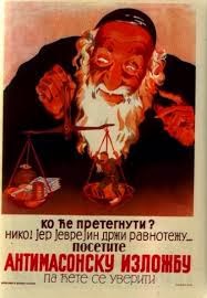
Illustration is power also, used to incredible effect as propaganda during the two world wars by both Nazi Germany and The Allies.


The British Using children to Manipulate men in an attempt to shame them into signing up for war


A Nazi antisemitic propaganda poster from Serbia

Commercially, illustration is a heavy weapon.
Advertising can be illustration at its strongest, if you see 2 golden arches on a red background, as you hurtle past on the motorway, you think McDonalds, a thought created by an illustration in a millisecond.
If you see those familiar arches in Japan, Dubai or Guatemala you understand what it means, Illustration can defy language barriers. it is a communication device.
It has been relevant since its inception, since man rubbed resin onto cave walls it has survived and been adapted, it is a man made super tool for global marketing and manipulation of the masses, crafted and nurtured from a single idea in a creative mind.
Illustration is a unique skill set to possess as it comes with endless potential to inspire people and emotion.
Illustration is lots of things, with no one singular form it surrounds us crafted and adapted over millions of years without losing any of its importance.


Wednesday, 18 December 2013

A Catch Up With the World Outside Uni

As well working for Uni towards my degree, I still receive the occasional commission, one long on going one has been one for a Manchester United team in eleven individual portraits, not a bad commission for such an avid football fan. Unless that is you support Manchester City, Hmm.
Started in March as an individual painting,


                                                                  Robin Van Persie


                  Raphael da Silva, Nemanja Vidic, David de Gea, Rio Ferdinand and Patrice Evra.

It was this painting that began a collection, I found myself painting in any spare time that I had, the next lots came in batches. the back line, then the forwards were painted after,.

                                                These two, Luis Nani & Antonio Valencia
                                                       (apologies for the poor cropping)


                                             Paul Scholes, Wayne Rooney and Ryan Giggs

Even though I was pleased with the outcome of each peice, I was more pleased with the evolution I could see happening, they were getting slightly better with each one that was completed with the Scholes and Giggs paintings backed onto red to highlight their personal 'legend' status within Manchester United folklore. 
As a sports fan it was a nice project to undertake, by the end I was happy to see the back of Manchester united in my work for a while as proud as seeing a full series of paintings together actually made me.

I also jumped on the 'Breaking Bad' band wagon, became an obsessive, gorged on 5 series as quickly as I possibly could then felt like it was only right to go on and paint something related, so taking on the Gaudi inspiration I felt a need for colour and just went for it. the result... 


Aaron Paul & Bryan Cranston as Jesse & Walter from Breaking Bad

Trying new things is fun and exciting when they pay off, and colour is still a fairly new aspect to my work, though striving to find meaning to put into my work is now an important factor, just doing something I like doing is still satisfying.

One last piece to show, is a reproduction of a painting I did during the summer before I became a student, a Clint Eastwood from the film Dirty Harry, the second time around I wanted to go bigger and use colours I felt represented the era the film was set in, the seventies, to me.


The browns and creams suited the era I was attempting capture perfectly I felt, and nicely in balance with such a bold back ground colour that does not take away from the actual image, works nicely sat on the purple 'work wall' in my kitchen too.
This was a commission with a difference, it was in trade for another kind of art that also set up the opportunity for a collaboration of a different kind. Tattooing.
The painting was an anniversary gift for the Husband of a friend of mine who happens to be tattooist.
Between the two of us we came up with a design I was happy with and then Jenny Bottomley (of The Tattooed Teapot in Manchester) did all the hard work I was left with this.


I love it, collaborative artistic design that I will have forever.


Meeting Chris Howker


Chris Howker and I had arranged a time best suited for him, for to visit Uni so we could have a sit down and talk over all things illustration.
On researching Chris, I found his website.. http://www.howks.co.uk/
It quickly became apparent that I had encountered Chris' work before and just not realised it.
Two and a half years ago, on applying to join the course, I was invited to attend the end of year graduates exhibition, 
After visiting I left with a feeling excitement, eagerness and of all the business cards and information made available to the exhibitions viewers, this.. 


                                     A postcard with Chris Howkers Boxing Lightbulb image

So I had seen Chris' Graduation exhibition and due to personal taste it was one of the exhibitions I was more drawn toward.
So, on arriving Chris sat down and we began chatting, I found him easy to talk to, and very down to earth, and as for willingness to help, he came with a sack full of books he thought I might find useful for my dissertation, in the rain, on a motorbike. 
We discussed lots of things from comic books, graffiti and street art as well as things like studio spaces.
Chris had seen a selection of my work before, an impromptu portfolio visit if you like.
My work is usually met with a certain amount of positivity, a level I had subconsciously began to take for granted it would seem.
As I read Chris' feedback, my initial reaction was to jump straight on the defensive, defend the integrity of my work.
After a second read through, the defense became acceptance. 
I couldn't really argue with the opinions of an established practitioner.
It was a new reaction to my work although complimentary, Chris questioned the integrity of my work, yes it is aesthetically pleasing he said but its a popular style, questioning my work, asking what does it mean?
The question that hit home the most was when Chris asked me whether the people who buy my art work are buying just that, my artwork or are they in fact just buying a pretty picture of their favourite icon?
An almost rude awakening came from this encounter, my work lacked meaning and was quite generic, it needs to stand out and to have a little meat on its proverbial bones, some fat for the viewer to chew over.
Meeting a professional and taking on board what he said has added another dimension to my working method, meaning.
How can I make my work mean something? aim it at a specific audience and let your work speak to them.
Further examples of Chris' work... 


Hand drawn Image for the 'May the  4th' exhibition in Leeds


Chris Howkers 'Fishtank' submission

So a thank you to the teaching staff for putting me in touch with my first professional contact, and coercing evolution into my work. 
Chris has left the door open for future contact, and I now understand the importance of opening as many doors as possible.
That importance there is knowledge behind everyone you manage to open.


Tuesday, 17 December 2013

Music and a Fishtank

The Fishtank is essentially an office, an eight metre glass fronted think tank office space situated in the offices of Manchester based 'studio of ideas' agency, Music.
The task at hand, to illustrate my interpretation of any music track to install on the fish tank's glass front.
Music is important to me so choosing the right song was going to be paramount.
Certain songs remind me of certain times and trigger certain memories, so I decided I'll choose a song from my childhood because that was a good time, I was a kid!
My Mum and Dad are both Motown and soul fans, so naturally a taste for it is passed down,
Using 'A Change Gon' Come' by Sam Cooke as inspiration I began playing with a time line ideas, to illustrate the evolution and rise in popularity of black music.
I began sketching Individual musicians from the 1950's onwards and attempting to arrange them into a  nice flowing composition


Flowing Time line of a Journey Through Black Music inspired by 'A Change Gon Come'

I had reached this point fairly quickly without much regard as to what materials I would use.
Usually the answer is obvious for me, paint. 
Except glass poses many problems that mean paint probably is not my best option.
After speaking to my Tutor, and a few small experiments, I decided maybe a vinyl sticker would do the job I had hoped the paint would do.
Trying and failing to come up with a background design that was both relevant to the fore image and not cliche was also difficult. 
The story behind the song though is a very sombre affair, and I didn't want that to be reflected in my work, nobody wants that baring over them for four weeks while they work.
I went back to the drawing board and began sketching more musicians, but from the era of real 'soul men'.
A memory of my Dad singing 'soul man' in the kitchen loudly and badly from my childhood  put the stamp of approval on my new choice.
so a newer array of little faces to arrange, but this time kept uniform and neat.
I also decided to go without colour, even with all my new found love for it, but this time it was because I felt black and greys depicted best the people and era I was trying to convey.


I adopted this style to assist the Vinyl application so as to  maximise its effect and 
 to play to its strengths

The eight artists are what I consider to be real 'Soul Men', I selected an image of each singer purposely smiling to add to the mood of the peace and compose them in a manner that suggestive a togetherness and closeness, except Jimi Hendrix, he got on purely on the basis that he is Jimi Hendrix, he is my 'because why not' element.
the singers left to right are: Ray Charles, Louis Armstrong, Marvin Gaye, Sam Cooke, Teddy Pendergrass, Otis Redding, James Brown and Jimi Hendrix.
The idea is quite a simple one, devised with mood effectiveness and ease of installation and removal in mind.
Vector the drawing, make it into an enormous sticker come jigsaw puzzle and add further details with paint (of course) to leave a thoughtful, positive image inspired by memories and music.
Sounds easy, but its a challenge I'd look forward too.


A much smaller scaled version of how I imagined it would look, except not floating over Stockport.


Post Inspiration Frenzy

Getting back home I was anxious to get started, it was like a kaleidoscope of ideas, one just blurred into another.
I wanted to try and be a little more free and less meticulous as Picasso often had, using the colours and 'because, why conform' spirit that Gaudi had evidently utilised throughout his architecture in Barcelona.
I decided to just get to it, and see what happened, using a new brief as subject matter I began to put some of the ideas down on paper.
After working in blacks and grey tones for so long, it was refreshing and actually quite therapeutic to just go at a canvas with no barriers or rules.
After a while I ended up with a few pieces that formed the basis of my 'fishtank' idea.


A free hand was let loose.


I painted the way I wanted.


Because I could.


And was surprisingly pleased at these results.

The inspiration is quite apparent and I was left feeling quite content at getting my own interpretations of Barcelona down as a visual instead of just an idea. 
Ideas that grew.