My second portfolio 'visit' was more of a showing as It was executed via E-mail.
In the second year of my course we were prompted to start contacting practitioners, one of the people I contacted was Benjamin Wachenje.
A full interview with him makes up an entire post of a previous blog.
Being inspired by his work on the Grand Theft Auto Computer game franchise some 10 years prior, I had become an admirer of most of his work as I felt that I could relate to his work and his subject matter since we are from similar backgrounds.
During the process of interviewing Ben I seized the opportunity to show him some of my work.
some of my own work and a couple of reproductions of his own work that I had I done in a 'deconstructing an art work' project in the first year'.
The feedback was all positive.
This probably was a good thing but led me to tread water.
It had left me with the idea that Benjamin Wachenje thinks my work is 'dope', no need to change anything and just keep doing what I am doing.
Where as when Chris Howker cast his eye over my work, he gave me a critique that was the catalyst for me wanted to evolve my work,
So because of the portfolio visit process I have learned two very important rules so far.
the First is not to be over awed by anybody whether you are a fan or not, it can lead to delusion or disappointment if what they say isn't as positive as what you are expecting.
I cant think of many more things more dis-heartening than being negatively fed back to by someone who you admire.
The second thing I have learned is not to take criticism personally, take it constructively and use it as fuel to evolve your work.
Merry Christmas Bloggers :)
Friday 20 December 2013
Thursday 19 December 2013
Website Review
I have recently started making enquiries about creating and maintaining my own web page.
A friend of mine put me in touch with a two web designers and was quoted from between £120 and £380 the assessment was automatic.
With web pages you get what you pay for.
That is not to say expensive is better or that being good looking is better than functional.
Each come with their own unique pro's and con's
I will compare and contrast 3 different websites, the first one I am going to look at is Benjamin Wachenje's online studio. http://www.benjaminwachenje.com/home.php
This website is brilliant, an 80's theme bedroom desk setup, using the same artistic style that defines much of Benjamin Wachenje's work.
Navigating through his various portfolio's and clearly labelled sections by using a roll over amstrad style joystick, bright and functional, with relevance to the artist and his work alike.
It is a fun place to be speaking in terms of online, in opposed to say the direct.gov website which is all very uniform and to the point and a chore to operate but also relevant to its task.
A website should be personal and have a streak of the owner throughout it especially one belonging to a creative mind.
Many leaves could be taken from this website's book in terms of design, personality and originality if that is way I feel to develop my website into
While researching for a previous post, I was looking for images and information regarding Noma Bar, the highly published illustrator so visited his webiste, which I must say, I had allowed myself to expect something mind blowing, and here it is http://nomabar.com/
Disappointed? yeah so was I. Nice imagery but unless I couldn't work out how to get beyond the contact details and everybody else did, its not a very exciting experience, there is however other web sites that do have galleries of his work, but I am concentrating on personal domain names not sections of other department store style websites.
One would expect Noma Bar to exhibit work on the website bearing his name, but to just have contact details, on a jpeg with albeit a nice image just seems slightly pretentious, and even though it contained contact details it made me he was more inaccessible.
If simple and efficient is the way I am compelled to take my own website then this, http://www.lizlomax.com/ would be an ideal example of simplicity meeting creativity but not to an excess.
Liz Lomax's website, is bright, clean, crisp and light hearted, made fun by the nature of her cheeky 3d artistic caricature sculptures of celebrities.
There is a feeling of welcome with this website, an excited eager feeling of 'come in and look around',
but with an air of gratitude, 'of thanks for visiting' when in contrast to Benjamin Wachenje's
site which leaves you feeling satisfied after play.
Fun and playful or simple and effective, both good choices I could see myself adopting for a website, I m not sure which maybe both?.
One thing is for sure, it wont be just my phone number, that what business cards are for.
I want my website to be an extension of my personality, something that stands out, its functional but not boring, I know what I wont do and that is set myself a budget as that instantly limits my options, plan and design then present the idea to a designer and then ask how much it would cost to bring that to life I understand money is a factor for many people and who knows what opportunities may come along because of owning my own web space,
An exciting prospect.
What is Illustration
This is a re-post as the original made very little coherent sense although it made sense to me, but thats not the point of a blog really is it, so here we go again..
What is an illustration? A question put to me while being interviewed for my place on the Illustration course.
'It's an image to accompany words' was my reply.
Now two and a half years on, I realise how much more I could have said after being asked a variation of the same question.
After nearly three years on the course I have been duly woken up and ceased to become a 'man at a bus stop with a narrow mind, brushing off that which I do not understand entirely, as 'crap'.
I am know of the understanding that illustration is far greater than a published image stood beside a blurb or a colourful hungry Caterpillar, more importantly it is the journey an idea takes from initial inspiration to becoming a finished piece of art.
How the illustrator nurtures an idea from seed to full grown and complete using unique research techniques, thought processes, ideas generation, experimentation, critique and evaluation, that is illustration.
Illustration is power also, used to incredible effect as propaganda during the two world wars by both Nazi Germany and The Allies.

Commercially, illustration is a heavy weapon.
Advertising can be illustration at its strongest, if you see 2 golden arches on a red background, as you hurtle past on the motorway, you think McDonalds, a thought created by an illustration in a millisecond.
If you see those familiar arches in Japan, Dubai or Guatemala you understand what it means, Illustration can defy language barriers. it is a communication device.
It has been relevant since its inception, since man rubbed resin onto cave walls it has survived and been adapted, it is a man made super tool for global marketing and manipulation of the masses, crafted and nurtured from a single idea in a creative mind.
Illustration is a unique skill set to possess as it comes with endless potential to inspire people and emotion.
Illustration is lots of things, with no one singular form it surrounds us crafted and adapted over millions of years without losing any of its importance.
What is an illustration? A question put to me while being interviewed for my place on the Illustration course.
'It's an image to accompany words' was my reply.
Now two and a half years on, I realise how much more I could have said after being asked a variation of the same question.
After nearly three years on the course I have been duly woken up and ceased to become a 'man at a bus stop with a narrow mind, brushing off that which I do not understand entirely, as 'crap'.
I am know of the understanding that illustration is far greater than a published image stood beside a blurb or a colourful hungry Caterpillar, more importantly it is the journey an idea takes from initial inspiration to becoming a finished piece of art.
How the illustrator nurtures an idea from seed to full grown and complete using unique research techniques, thought processes, ideas generation, experimentation, critique and evaluation, that is illustration.
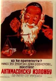
Illustration is power also, used to incredible effect as propaganda during the two world wars by both Nazi Germany and The Allies.

The British Using children to Manipulate men in an attempt to shame them into signing up for war
A Nazi antisemitic propaganda poster from Serbia
Commercially, illustration is a heavy weapon.
Advertising can be illustration at its strongest, if you see 2 golden arches on a red background, as you hurtle past on the motorway, you think McDonalds, a thought created by an illustration in a millisecond.
If you see those familiar arches in Japan, Dubai or Guatemala you understand what it means, Illustration can defy language barriers. it is a communication device.
It has been relevant since its inception, since man rubbed resin onto cave walls it has survived and been adapted, it is a man made super tool for global marketing and manipulation of the masses, crafted and nurtured from a single idea in a creative mind.
Illustration is a unique skill set to possess as it comes with endless potential to inspire people and emotion.
Illustration is lots of things, with no one singular form it surrounds us crafted and adapted over millions of years without losing any of its importance.
Wednesday 18 December 2013
A Catch Up With the World Outside Uni
As well working for Uni towards my degree, I still receive the occasional commission, one long on going one has been one for a Manchester United team in eleven individual portraits, not a bad commission for such an avid football fan. Unless that is you support Manchester City, Hmm.
Started in March as an individual painting,

Robin Van Persie

Raphael da Silva, Nemanja Vidic, David de Gea, Rio Ferdinand and Patrice Evra.
It was this painting that began a collection, I found myself painting in any spare time that I had, the next lots came in batches. the back line, then the forwards were painted after,.
 These two, Luis Nani & Antonio Valencia
(apologies for the poor cropping)

Paul Scholes, Wayne Rooney and Ryan Giggs


Started in March as an individual painting,

Robin Van Persie

Raphael da Silva, Nemanja Vidic, David de Gea, Rio Ferdinand and Patrice Evra.
It was this painting that began a collection, I found myself painting in any spare time that I had, the next lots came in batches. the back line, then the forwards were painted after,.

(apologies for the poor cropping)

Paul Scholes, Wayne Rooney and Ryan Giggs
Even though I was pleased with the outcome of each peice, I was more pleased with the evolution I could see happening, they were getting slightly better with each one that was completed with the Scholes and Giggs paintings backed onto red to highlight their personal 'legend' status within Manchester United folklore.
As a sports fan it was a nice project to undertake, by the end I was happy to see the back of Manchester united in my work for a while as proud as seeing a full series of paintings together actually made me.
I also jumped on the 'Breaking Bad' band wagon, became an obsessive, gorged on 5 series as quickly as I possibly could then felt like it was only right to go on and paint something related, so taking on the Gaudi inspiration I felt a need for colour and just went for it. the result...

Aaron Paul & Bryan Cranston as Jesse & Walter from Breaking Bad
Trying new things is fun and exciting when they pay off, and colour is still a fairly new aspect to my work, though striving to find meaning to put into my work is now an important factor, just doing something I like doing is still satisfying.
One last piece to show, is a reproduction of a painting I did during the summer before I became a student, a Clint Eastwood from the film Dirty Harry, the second time around I wanted to go bigger and use colours I felt represented the era the film was set in, the seventies, to me.

The browns and creams suited the era I was attempting capture perfectly I felt, and nicely in balance with such a bold back ground colour that does not take away from the actual image, works nicely sat on the purple 'work wall' in my kitchen too.
This was a commission with a difference, it was in trade for another kind of art that also set up the opportunity for a collaboration of a different kind. Tattooing.
The painting was an anniversary gift for the Husband of a friend of mine who happens to be tattooist.
Between the two of us we came up with a design I was happy with and then Jenny Bottomley (of The Tattooed Teapot in Manchester) did all the hard work I was left with this.

I love it, collaborative artistic design that I will have forever.
Meeting Chris Howker
Chris Howker and I had arranged a time best suited for him, for to visit Uni so we could have a sit down and talk over all things illustration.
On researching Chris, I found his website.. http://www.howks.co.uk/
It quickly became apparent that I had encountered Chris' work before and just not realised it.
Two and a half years ago, on applying to join the course, I was invited to attend the end of year graduates exhibition,
After visiting I left with a feeling excitement, eagerness and of all the business cards and information made available to the exhibitions viewers, this..

A postcard with Chris Howkers Boxing Lightbulb image
So I had seen Chris' Graduation exhibition and due to personal taste it was one of the exhibitions I was more drawn toward.
So, on arriving Chris sat down and we began chatting, I found him easy to talk to, and very down to earth, and as for willingness to help, he came with a sack full of books he thought I might find useful for my dissertation, in the rain, on a motorbike.
We discussed lots of things from comic books, graffiti and street art as well as things like studio spaces.
Chris had seen a selection of my work before, an impromptu portfolio visit if you like.
My work is usually met with a certain amount of positivity, a level I had subconsciously began to take for granted it would seem.
As I read Chris' feedback, my initial reaction was to jump straight on the defensive, defend the integrity of my work.
After a second read through, the defense became acceptance.
I couldn't really argue with the opinions of an established practitioner.
It was a new reaction to my work although complimentary, Chris questioned the integrity of my work, yes it is aesthetically pleasing he said but its a popular style, questioning my work, asking what does it mean?
The question that hit home the most was when Chris asked me whether the people who buy my art work are buying just that, my artwork or are they in fact just buying a pretty picture of their favourite icon?
An almost rude awakening came from this encounter, my work lacked meaning and was quite generic, it needs to stand out and to have a little meat on its proverbial bones, some fat for the viewer to chew over.
Meeting a professional and taking on board what he said has added another dimension to my working method, meaning.
How can I make my work mean something? aim it at a specific audience and let your work speak to them.
Further examples of Chris' work...

Hand drawn Image for the 'May the 4th' exhibition in Leeds

Chris Howkers 'Fishtank' submission
So a thank you to the teaching staff for putting me in touch with my first professional contact, and coercing evolution into my work.
Chris has left the door open for future contact, and I now understand the importance of opening as many doors as possible.
That importance there is knowledge behind everyone you manage to open.
Tuesday 17 December 2013
Music and a Fishtank
The Fishtank is essentially an office, an eight metre glass fronted think tank office space situated in the offices of Manchester based 'studio of ideas' agency, Music.
The task at hand, to illustrate my interpretation of any music track to install on the fish tank's glass front.
Music is important to me so choosing the right song was going to be paramount.
Certain songs remind me of certain times and trigger certain memories, so I decided I'll choose a song from my childhood because that was a good time, I was a kid!
My Mum and Dad are both Motown and soul fans, so naturally a taste for it is passed down,
Using 'A Change Gon' Come' by Sam Cooke as inspiration I began playing with a time line ideas, to illustrate the evolution and rise in popularity of black music.
I began sketching Individual musicians from the 1950's onwards and attempting to arrange them into a nice flowing composition

Flowing Time line of a Journey Through Black Music inspired by 'A Change Gon Come'
I had reached this point fairly quickly without much regard as to what materials I would use.
Usually the answer is obvious for me, paint.
Except glass poses many problems that mean paint probably is not my best option.
After speaking to my Tutor, and a few small experiments, I decided maybe a vinyl sticker would do the job I had hoped the paint would do.
Trying and failing to come up with a background design that was both relevant to the fore image and not cliche was also difficult.
The story behind the song though is a very sombre affair, and I didn't want that to be reflected in my work, nobody wants that baring over them for four weeks while they work.
I went back to the drawing board and began sketching more musicians, but from the era of real 'soul men'.
A memory of my Dad singing 'soul man' in the kitchen loudly and badly from my childhood put the stamp of approval on my new choice.
so a newer array of little faces to arrange, but this time kept uniform and neat.
I also decided to go without colour, even with all my new found love for it, but this time it was because I felt black and greys depicted best the people and era I was trying to convey.

I adopted this style to assist the Vinyl application so as to maximise its effect and
to play to its strengths
The eight artists are what I consider to be real 'Soul Men', I selected an image of each singer purposely smiling to add to the mood of the peace and compose them in a manner that suggestive a togetherness and closeness, except Jimi Hendrix, he got on purely on the basis that he is Jimi Hendrix, he is my 'because why not' element.
the singers left to right are: Ray Charles, Louis Armstrong, Marvin Gaye, Sam Cooke, Teddy Pendergrass, Otis Redding, James Brown and Jimi Hendrix.
The idea is quite a simple one, devised with mood effectiveness and ease of installation and removal in mind.
Vector the drawing, make it into an enormous sticker come jigsaw puzzle and add further details with paint (of course) to leave a thoughtful, positive image inspired by memories and music.
Sounds easy, but its a challenge I'd look forward too.

A much smaller scaled version of how I imagined it would look, except not floating over Stockport.
Post Inspiration Frenzy
Getting back home I was anxious to get started, it was like a kaleidoscope of ideas, one just blurred into another.
I wanted to try and be a little more free and less meticulous as Picasso often had, using the colours and 'because, why conform' spirit that Gaudi had evidently utilised throughout his architecture in Barcelona.
I decided to just get to it, and see what happened, using a new brief as subject matter I began to put some of the ideas down on paper.
After working in blacks and grey tones for so long, it was refreshing and actually quite therapeutic to just go at a canvas with no barriers or rules.
After a while I ended up with a few pieces that formed the basis of my 'fishtank' idea.

A free hand was let loose.

I painted the way I wanted.

Because I could.

And was surprisingly pleased at these results.
The inspiration is quite apparent and I was left feeling quite content at getting my own interpretations of Barcelona down as a visual instead of just an idea.
Ideas that grew.
Inspired by Barcelona Pt2: The Picasso Museum
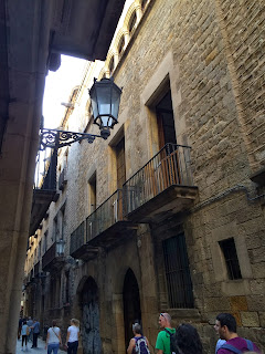
Barcelona's 'Gothic Quarter' is like a step back in time, the streets are narrow and cinematic with washing lines hung between the buildings either side of these picturesque through ways with louvred shutters flanking tall glass windows set behind yet more detailed wrought iron balconies.
It sounds like romanticising because it is, in the short time I was there I feel in love with Barcelona.
The history is evident, the passion and home pride of the Catalonian people is unmistakable.
So it is no surprise that when Pablo Picasso was drawn there as a youth, he blossomed.
An extensive collection of his early works can be found in the museum which itself is built inside five adjoining medieval palaces.
Excited, as I stated in one of my first blogs, Picasso was a major reason and influence to me ever beginning an interest in art. I was not disappointed.
It is a surreal feeling to be standing so close to a painting created by probably the most recognisable name in the entirety of art history.
Standing so close you can see the brush strokes that a master put there himself. Pure Inspiration.
The gallery, houses over 3500 pieces from small pockets sketch books to full framed art works,
I was unsure of the rules around photography, so I took very few pictures,.. and quickly.

The exterior of the five palaces that house Picasso's work

Science and Charity

Las Meninas, a Picasso homage to another Spanish master, Velazquez.
Salvador Dali also painted a version in Homage.
Just being in the same rooms as these works and masterpieces is an abundance of inspiration, teamed with it being in the city defined by Gaudi's presence and steeped in so much rich and varied history.
A history built on art, whether that be design, architecture or football, whatever we regard as art, examples of it can be found in Barcelona.
History and modernity live in a healthy balance in Barcelona, within which, history is the most apparent and modernity is allowed to happen, but in the back ground.
Four nights was not enough time in Barcelona but was still more than enough to return home raring to go and put some of that I had encountered into my own work.
Inspired by Barcelona
During the last reading week, my Fiancee and I took a short trip to Barcelona.
I had heard endless words of praise from many mouths about Barcelona and so left with high expectations.Armed with a list of places which we had been told, we HAD to see while we were there, we arrived and even in the taxi from the airport, the historic atmosphere was blatant.
The architecture (which was especially spoken of in high regard), was amazing.
Every building seemed to have its own uniqueness, smooth flowing curves, colour or decorative iron work balconies. Generic has no home in Barcelona.
First things first though. Being a big football fan I had to visit Camp Nou, a football mecca and home ground to FC Barcelona. (obvs).
Getting there was a rather dull affair, using the cities underground metro system, so there was not much to see except the occasional hyperactive busker.
Once off the train we emerged outside the University of Barcelona, which in itself as a building though it is a modern build it still holds an aura of majesty.
Arriving at the football stadium was almost anti climax (almost) as from the outside much of the building is obscured by giant advertising banners, but I wanted to see this place from the inside.

I know this is not much related to art, but it is definantley a level of inspiration useful to a creative mind.
An afternoon spent posing next to trophies and reading up on the assorted sporting memorabilia on offer within the stadium, we went off in search of other MUST see's.
While ambling around the city, I found myself spending more time looking up past the burger king and footlocker signs that took up 90% of my peripherals for more examples of the scenic architecture that makes Barcelona the place it is.
In need of a notebook, we found a Catalonian version of 'Hobby Craft', and while looking for something to scribble reminders into, I accidentally found this...


I knew what I was looking at after taking a second to realise, my limited knowledge of Barcelona did actually contain a section on Antoni Gaudi, a Spanish architect, famed for his extrovert approach to the design n construction of buildings.
This, that I had stumbled on by going onto the sun terrace at the back of a stationary shop was in fact Casa Batllo, the view from the back.
Instantly recognisable, as Gaudi's work by the large, colourful mosaic work adorning the roof terrace that stretches either side down almost framing the building and by the fine, intricate iron work that threw amazing shadows and shapes in all directions.
Distracted by my discovery I left the shop and headed around the very next corner to find the rest of Casa Batllo.
And I did,...

Casa Batllo, was a Gaudi designed home off a wealthy family living in a upper class neighbourhood of Barcelona.
Skeletal in design, hence the nickname 'The House of Bones', unique ornate flowing stone, wild arch ways and daring stained glass with skull shaped balconies.
The roof is said to be shaped after the arch on a dragons back, with the spear of St George protruding from it as a turret.
An amazing amount of imagination, vision, creativity and genius made this building, and in 1887, to make it even slightly more amazing, (considering the lack of modern day building aids)
This place was a fountain of inspiration!

The roof of Casa Batllo, (not my image) I couldnt see the roof for the trees!
Now Im in Barcelona, finding the first (non sport related) landmark and decide the more the merrier so went of in search of Gaudi's crown in the jewel, Sagrada Familia, an 18 spire (on eventual completion) cathedral in the heart of Barcelona.
Later that day... much later, we found it, surrounded by fast food chains, and gift shops, the tallest most atmospherically dominating place I have ever seen,
After the initial astonishment wears off and you begin to acknowledge and admire the intricacy and detail applied to every stone in the building, but this was night time, so we decided to come back in the morning,.
Next morning, same place. We had not seen the half of it. Literally.


Sagrada Familia at night, with Gaudi's signature on the construction fences.


Sagrada Familia by day
The level of detail within every piece of stone that makes up this cathedral is mesmeric, you find yourself stood imagining the painstaking carving that went into the stories depicted within the four facades that adorn one side of the building each.
But imagining with respect for the talent and artistic integrity of the stone masons of the day.
Building began in 1882, and still will not be finished for an estimated thirteen further years (2026).
This is more than Gaudi's lifes work this monument is his legacy, built on private funds work has had to cease many times since the ground was broken on the site.
The magnificence and awe that this place gives off just feeds imagination endlessly.
The visit was fast becoming a Gaudi hunting expedition, so we broke it up by visiting the Pablo Picasso museum, which my next blog will be about.
Day three we agreed to visit Guell Parc, another Gaudi project.
It was designed as a getaway for residents of Barcelona, away from the smokey city high up on a hillside.
It is a massive amount of land with many separate elements to it, all though wear the Gaudi brand of imagination and design obviously.


Guell Parc, is like a fantasy land, it reminded me a theme park, but one without rides, it was fun because of the way it had been designed, it was brightly coloured full of twisted columns and curved stone,
even the buildings are designed in a way that makes it feel like they are having fun.
The sense of 'why cant I do this or do that' in Gaudi's work is what I found most appealing about all of his works that I had visited, and not only did he do it, he did it how we wanted to do it, and succeeded on the basis of over a century later people still in wonder at his works, both complete and those STILL under construction.
And if that isn't inspiration then I'm never going to find any.
Wednesday 9 October 2013
Hopes, Fears, Opportunities
I have been asked to share my hopes, fears and opportunities for the coming year and beyond.
So, here goes.
My hopes and what I wish to achieve this year and after graduation.
First, I'd like to graduate with my desired mark, that is the main aim for this year, after graduation I am hoping to go on and do some teacher training, but I'm still not sure of the specifics.
That was the aim two years ago when I joined the course to be fair but the closer it gets the more important it has become.
Beyond that the hope is to actually go on and teach, possibly at high school level, and continuing to practise and develop my own work around that.
my career choices have been swayed by wanting to secure a happy future for my young family and being a Dad my children are proud off. this was the incentive for joining the course in the first place.
My Fears and what is worrying me about this year, and beyond graduation
I don't have any real fears beyond failing the course, I am confident that I will see it through, but whether I will achieve my desired mark is another thing, that is really my only worry.
throughout the duration of our course we have been repeatedly told, we will get the mark we deserve, so I decided I was going to deserve the mark I want, that way if I don't achieve my desired target, I cant point the finger anywhere but at myself.
So I have approached this year with a new more determined than ever attitude and renewed vigour.
That's pretty much all of it, in way of fears other than the usual snakes and clowns thing anyway.
Opportunities and which events have good potential for me this year, I am of the thinking that every day carries potential it just depends on what you do with the day.
I recently made the mistake of non holding, networking and contacting practitioners as something of major importance as I want to go on and teach and not Illustrate as a career, well full time nine to five anyway.
Within days of coming to that assumption I was proved wrong when I received much assistance, advice and inspiration from practitioners I had contacted and those I had spoken to already.
This led me to realise.
Opportunities rise all the time and as long as I see them when they do I can make the most of them and I suppose that will happen by keeping an open mind.
Well that is my thoughts on fears, hopes and opportunities.
Akse p19, Graffiti vs Vandalism
There is a danger of this post turning into a rant.
On a recent research expedition into the back streets and 'trendy' Northern Quarter of Manchester
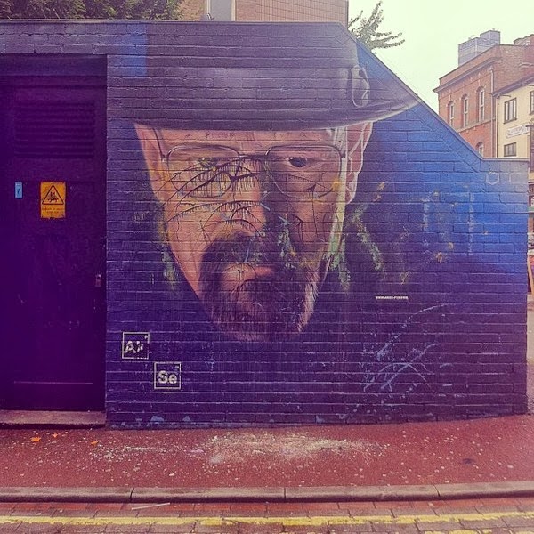
I came across a portrait on the electricity substation on Tib Street.
The portrait was of Walter White, the main protagonist from the television series Breaking Bad.
The Artist is Akse p19, a spray can artist working out of Manchester, who working with 'out house project' a team working toward creating street art in and around the Northern Quarter are of Manchester City Centre.
The Out House Project support and are sponsored by local businesses in the Northern Quarter also.
http://outhousemcr.thecolouringbox.co.uk/
Anyway my main point... that after the time, work, effort, money and talent that went into the portrait, it was vandalised.


On a recent research expedition into the back streets and 'trendy' Northern Quarter of Manchester
I came across a portrait on the electricity substation on Tib Street.
The portrait was of Walter White, the main protagonist from the television series Breaking Bad.
The Artist is Akse p19, a spray can artist working out of Manchester, who working with 'out house project' a team working toward creating street art in and around the Northern Quarter are of Manchester City Centre.
The Out House Project support and are sponsored by local businesses in the Northern Quarter also.
http://outhousemcr.thecolouringbox.co.uk/
Anyway my main point... that after the time, work, effort, money and talent that went into the portrait, it was vandalised.

There was some opposition to the piece as it depicted Walter White, a fictional bumbling drug dealer,
it was said to 'glorify' crime and 'rub people who have battles substance abuser's nose in it'.
It was seeing the art work in the latter state that the I realised graffiti is not vandalism, vandalism is something else and I was stood looking at the perfect example of how the two are different.
Before the content of the piece is even taken into consideration the skill and aesthetics of the work are immediately apparent.
Even if you didn't agree with what it was 'saying' why would you want to spoil something that looks so good? I could not get my head around the fact, people had a problem with it as it 'condoned crime' then those same people cheered when it was criminally damaged and left looking like the back of a toilet door in a pub.
After mulling it over decided to try and find the answers, and so this is going to be the topic of my dissertation.
Is Graffiti, Vandalism? (or along those lines) its a working title.
The irony.
A Round Up Since Last Time I Blogged
Apologies for the extensive delay in blogging! it has been down to a mixture of being busy with commission work, other uni work, family life and I must admit a certain amount of procrastination.
In the early part of the summer I stumbled across a Japanese artist, Riusuke Fukahori, who paints three dimensional fish built up by layers of resin.
This stood out for me as I had experimented a couple of times during my course with sculpture,
(well shaping things from florist foam anyway) but after seeing this, the intricacy of the process and the skill of the actual painting I think I will leave it to the experts from now on!
http://www.thisiscolossal.com/2012/01/riusuke-fukahori-paints-three-dimensional-goldfish-embedded-in-layers-of-resin/


Between working and chasing kids around this Summer I did manage to find some time to do some painting.
After years of working in black and white with the occasional cameo by one of the primary colours, I decided now was the time to blow the dust of my colour wheel and see what i could do.
I also let go of my anally retentive attitude towards painting and let myself be a little fluid and rough with my work.
The results were quite a pleasant surprise and received some very nice feedback amongst the general public... these are the best of what I did over the time.


I also bought and began practising with an airbrush, Its a bit more difficult than I first thought but once I have figured out the process and played with it a little more the outcomes will be more exciting!
I have also set up a page on facebook for my own artwork, which was something I have meant to do for a long time, I finally got around to it and I have to admit it feels good to have another platform for my art work to be seen on. There is a link below.

Apologies for the poor camera work!
Things in the third year of my course, have started at full pelt, there is no time to waste, so my time management has had to be addressed, I even bought a diary!
so after having a little word with myself, it is the time to completely knuckle down and immerse myself in my work completely and with minimal distractions, to the extreme I gave my Playstation away.
Unfortunately though, nobody was as eager to take my children, so Im stuck with them. >ahem<
Finally, since being back at Uni in Sept, the College put me in touch with a graduate of the course from the year I started, this 'guru' or mentor, Chris Howker is a professional Illustrator and has offered some great advice and has made me question the relevance of my work and the direction in which it is going since I contacted him, emphasising the importance of evolving and trying new things.
Below is a link to Chris' site, It is definantly worth a look!...so look!.
Friday 3 May 2013
Research for 8x8 Project...
For the 8x8 brief, I was given a short story by a creative writing student named Adam Glennon, called Jack and I.
A brief outline of the story, which really caught my imagination is, a fight between a man and his inner demons, a darker side of his personality that is planning to take over and lead Jack's life for him.
this led me to start looking at split personalities and thinking about how I could catch this subject in an image.
After meeting Adam and a brief consultation we decided to work towards a sequential image, comic book style lay out,
I tried this and was struggling to make it work, even looking at Frank Millers graphic novel work, I was not happy with the direction and aesthetics of how it was developing.
Talking to my tutor, I realised, I could create one full image to 'sum up' the story, this made me quite a happy bunny and filled me with re-newed drive.
I began drawing up and digitally playing with photo's of classmates faces in order to put together a kind of 'morphing' image, showing the journey from one side of the personality to the other.
Again, it was a direction I was not best pleased with as it gave the image a 'Dr Jekyll and Mr Hyde' vibe more fitting of the Bruce Banner's transformation into the Incredible Hulk rather than the battle between to sides of a personality within a persons mind.


Examples of Frank Millers Graphic work from the Sin City graphic Novel


Examples, of the Jekyll and Hyde Images I used for inspiration but eventually decided to work away from.


A brief outline of the story, which really caught my imagination is, a fight between a man and his inner demons, a darker side of his personality that is planning to take over and lead Jack's life for him.
this led me to start looking at split personalities and thinking about how I could catch this subject in an image.
After meeting Adam and a brief consultation we decided to work towards a sequential image, comic book style lay out,
I tried this and was struggling to make it work, even looking at Frank Millers graphic novel work, I was not happy with the direction and aesthetics of how it was developing.
Talking to my tutor, I realised, I could create one full image to 'sum up' the story, this made me quite a happy bunny and filled me with re-newed drive.
I began drawing up and digitally playing with photo's of classmates faces in order to put together a kind of 'morphing' image, showing the journey from one side of the personality to the other.
Again, it was a direction I was not best pleased with as it gave the image a 'Dr Jekyll and Mr Hyde' vibe more fitting of the Bruce Banner's transformation into the Incredible Hulk rather than the battle between to sides of a personality within a persons mind.
Examples of Frank Millers Graphic work from the Sin City graphic Novel


Examples, of the Jekyll and Hyde Images I used for inspiration but eventually decided to work away from.

After attempting to digitally create 'morphing' effect, I went back to the drawing board to develop other ideas as I felt this was not conveying the story correctly.
Some of the compositional idea, quick sketches that I deliberated over.


In the end, I settled on a back to back composition, to represent to sides pulling in opposite directions, rather than directly opposing each other.
I drew this out and painted it in my own style, which I feel didn't really work, the format was 2 small and make the image look 'blobby'.
So I tried again using a washier paint and Ink mix as it would leave a sharper looking image, I also used this media for the banner as well.

This is the first painted rendition, the format left the image looking stretched, this was another reason that I went on and re did the painting using looser media.

I was much happier with this outcome, and decided to put it onto photo shop to see if I could further develop it...

The mix of digital and water colour works well as a contrast but still lacks something I feel.
I will keep experimenting and iron out all the kinks of this one, Lesson learnt, choose your own format if possible!
GO BIG!!
Subscribe to:
Posts (Atom)